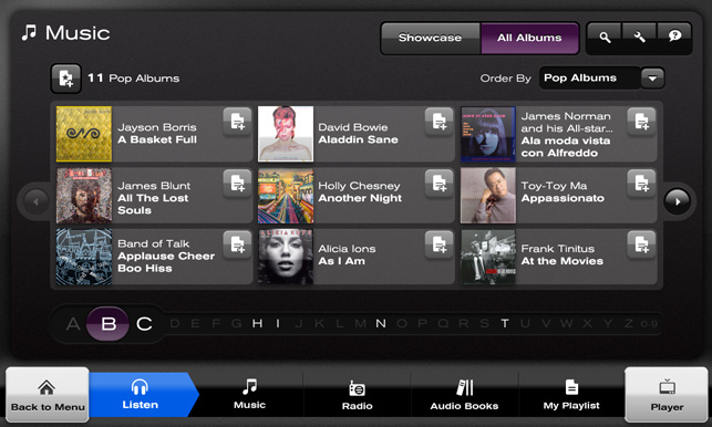
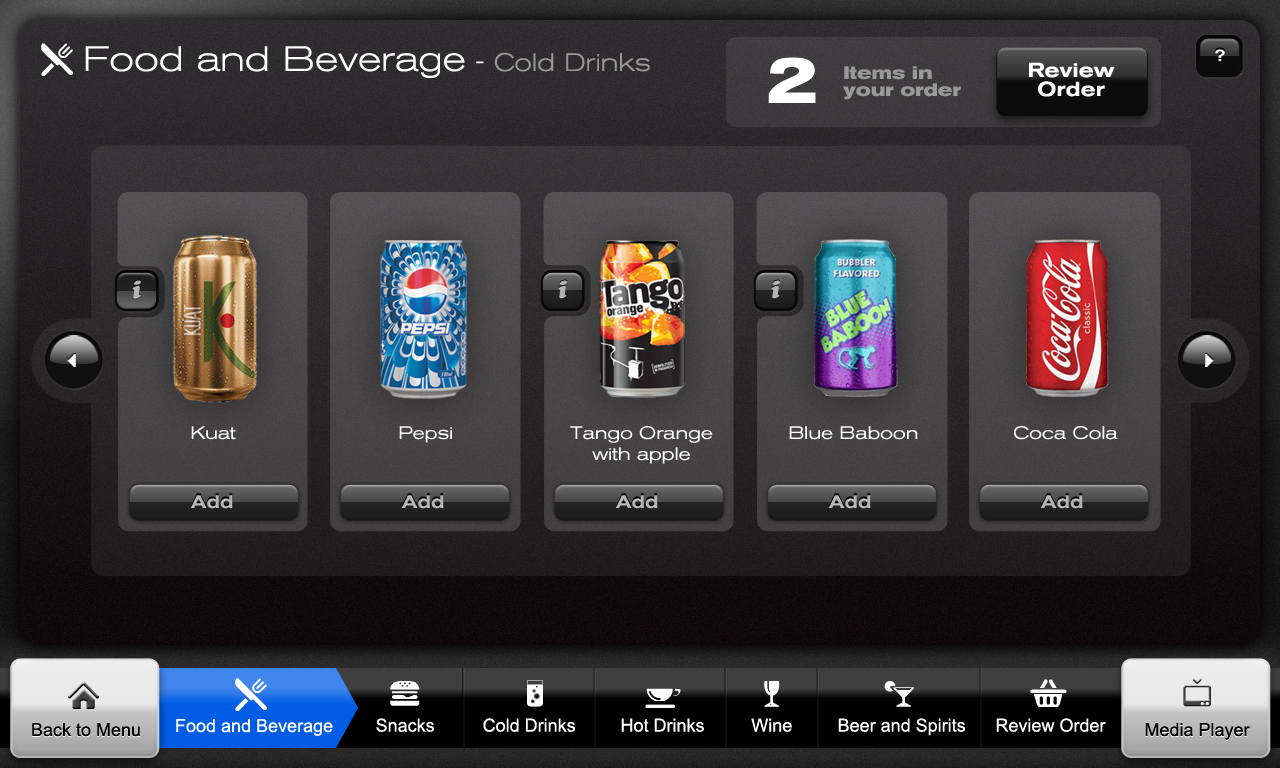
Using a design template, my main challenges while working on the long haul in-flight project were designing the grid and alphabet navigation mechanism for the music section, designing the grid and look & feel for the Food & Drink section, flash animation for loading screens and some variations of the way that the main menu control would act and feel.
Adapting the look and feel for new controls was a major factor. The alphabet selector was a difficult problem as the minimum button size was 64 x 64 pixels. 26+ buttons at that size would take us way beyond the 1024 screen resolution we had to work in. I came up with a "hot zone" of three letters nearest the users touch point on the screen. If the user had pressed B, the screen would show all albums made by bands beginning with B. The Alphabet selector would magnify the letter B and the letter either side of it. The user would easily be able to touch A or C next if that was what they had intended.
Real estate on seat back screens is in short supply and finding room for increasing navigation functionality became problematic. The essentially small buttons on either side of the music items became known as "hippo ears" and were used on all other catalogue screens.
Towards the end of the project, we had fun illustrating kids wallpapers. The only constraint was that the control positions had to remain constant throughout.