Click here to see the UX case study
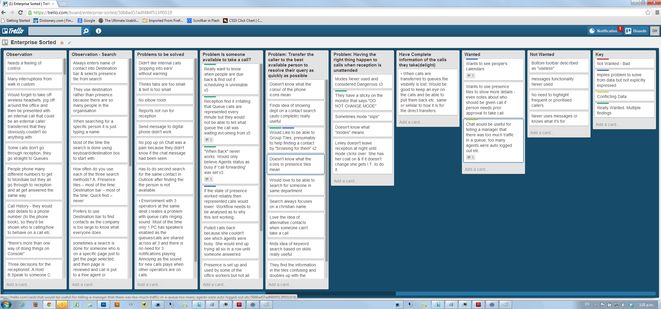
I visited and observed operators at a variety of businesses, large and small. I also posted a trello board questionaire and asked people to communicate any loves + hates.
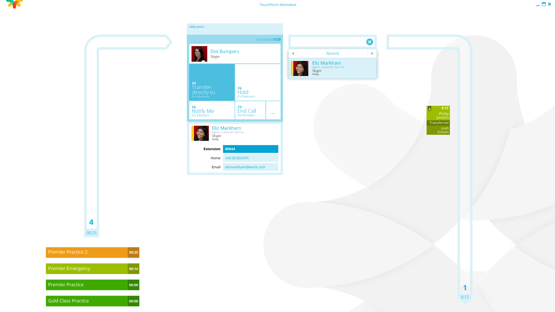
Mainfreight operators would talk to walk in custom, while being delivered up to 3 calls a minute, so clear and obvious call status was key.
Calls arriving on the left are shown in a colour coded priority. Once a call is accepted by the operator, the centre of the screen is dedicated entirely to the call, it's information and its probable transfer destination.
After the call has been distributed, the call and it's status are displayed in a 'waterfall' on the right, until the call is accepted or recalled.
Really fast visual understanding of what was happening on the monitor and who was in the Console operators ear was paramount. This is a screen that is looked at all day long, so I invested some fun and maximised demarcation clarity with the design. Animation of screen elements gives a smooth, pleasing feeling of progression through each process. I used Illustrator for the design and Flash to mock up the animations. I made the product animations using CSS.
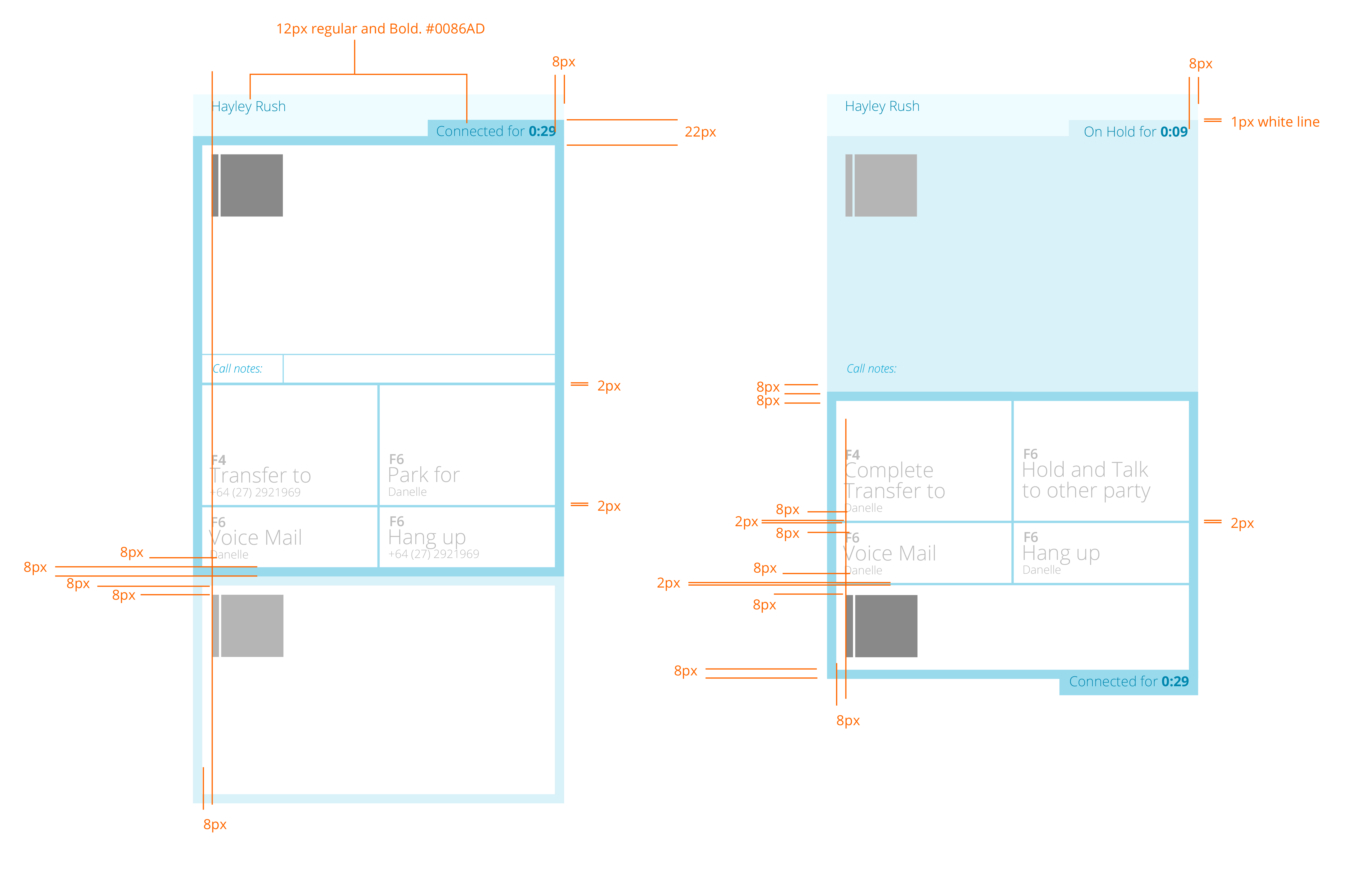
Below are some of the visuals and mark-ups for development. Before them is a screen grab of a Trello board with notes of objectives and problems faced by the console operators of six different organisations that were observed during repeated visits over the period of a month.


James Skay,
senior product marketing manager,
Microsoft Skype for Business Developer Platform,
Microsoft Corp.